




“Give agents authority. Keep control.”
“RuleEvo checks scoped authority before admission in integrated workflows.”
“Withdraw future authority. Reconcile uncertain outcomes.”
“A bounded prototype seeking design partners.”
 Back to RuleEvo ↗
A precise, calm identity for agents that act in business systems. The shield-R signals an explicit boundary. Violet brings possibility; ink brings clarity.
Download brand kitSVG masters · Transparent PNGs · Social card · Usage guide
Use the full logo when space allows. Use the mark at small sizes or where the name already appears.




Standalone marks: Primary SVG · Reverse SVG · Ink SVG · White SVG
PNG marks are supplied at 64, 256 and 512 pixels. Outlined wordmarks are included in every variant.
#25283BPrimary text and dark surfaces#6950C7Identity and emphasis#F7F5EFPrimary light surface#E6DFF6Supporting light surface#625E70Secondary text on light surfacesUse ink or muted ink for small copy on ivory and lilac. Use ivory or white on ink. Use violet on ivory for emphasis. Check contrast when pairing colours; pale accent colours are surfaces, not small text. Status must always include a readable label.
Give agents room to work.
Keep control.
Interface and editorial type use the system sans-serif stack: Inter when available, then ui-sans-serif, system-ui, Apple and Segoe UI fallbacks. No remote font request is required. Use ui-monospace for identifiers and technical labels.
The supplied wordmark is outlined from DejaVu Sans Bold and Regular for consistent reproduction. Use the vector master rather than retyping it.
Leave at least half the shield’s width clear on all sides. Keep the standalone mark at least 24px wide and the full logo at least 140px wide on screen. For tiny favicons use the supplied mark.
Explain the action, the boundary and the observable result. Use plain verbs and concrete limits. Sound like a thoughtful technical partner. Describe what exists today separately from what a future integration could support.
“RuleEvo checks scoped authority before admission in integrated workflows.”
“Withdraw future authority. Reconcile uncertain outcomes.”
“A bounded prototype seeking design partners.”
No “every agent must pass through us,” “instant global stop,” “guaranteed undo” or “Google-certified.”
No invented customer logos, independent audits, uptime promises or claims of proven customer demand.
Use “proposed pilot” for the offer. Commercial billing is not enabled.
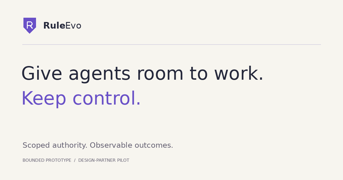
Use the 1200 × 630 card for link previews and introductions. It is a brand card, not a product screenshot or evidence of customer outcomes.
Download share image ↓